Aim:Now you are starting to develop your concept into a feasible, workable design you need to start thinking in a bit more detail. This project will help you specify the materials that your pavilion is going to be made from, and why. Every project must include this so that you and others know what the structure and its elements will be made from and how will be constructed. The materials may also help shape and form your final design.
Aim: This exercise will help you to work through your concept using sketches and model-making. The concept development is an essential part of the design process as it shows how your concept evolves. It is important in knowing which parts to keep and which parts to discard. This can happen throughout the process, and then you may go back a number of steps, to reincorporate something discarded. For this reason, it is important that the process is visualised and undertaken chronologically. If this is done after a design has been realised, in what we called (post-rationalisation) it can lead to design failure. Ultimately the aim of this exercise is to develop your ability to critically analyse and assess your own work so that you can make confident design decisions. If you feel at this stage you need to radically change or alter parts of the design, now is the time to do it.
Aim: This exercise will help you to form a concept for your design. A concept is an initial or abstract idea that has yet to be fully developed. In order to create a meaningful space or place, a good designer always has a rationale for the look and feel of their design. The decisions they make about size, shape, form, materials, details and organisation of elements are inspired, influenced or informed by the site (or context), the occupant and the function. The overriding idea that drives all these decisions is called a concept.
Aim: In this exercise you will select the ‘occupant’ and the ‘function’ for your brief, and using this additional information, you can define your brief further. Whenever we design anything, whether it’s an interior, a building, an object or a piece of furniture, we should always design for the user. This user can be a single person or a particular type of person, such as a specific age group or gender. This does not mean that you are excluding all other people or groups, but it allows you to design with more focus. For example, a shop that sells clothes aimed at teenagers and twenty-somethings will have an interior that has been designed with a particular look and feel (and possibly sound) that appeals to that specific demographic, but it shouldn’t make other age-groups feel completely unwelcome (although sometimes that is the case!). User-led design will ensure that your design is always appropriate and relevant. The user is sometimes referred to as the client, customer, consumer, end-user, target audience, but in interior design, it is more typically known as the ‘occupant’. Similarly, buildings and interiors usually cater for a specific need or have a specific use. They can be multi-purpose (such as Hybrid Spaces, which we will discuss in later courses), but they are usually designed to accommodate a specific activity or to provide a specific experience to the occupant or user. In Architecture and Interior Design, the use or purpose of a building is often referred to as ‘function’.
All three of these occupant options would work within Lichfield, as there are train stations for commuters to access the City, a park close to my location for children and many café’s and scenic areas for the aging community. However, based on my research and my chosen location, not many commuters will pass my pavilion. So, choosing them as an occupant would be difficult as it is over a ten-minute walk away from the public transport hotspots. I think both children and the aging community would work well for my Pavilion’s chosen occupant as the location brings in both age groups. Having the pool with ducks brings children to see and feed them, there is also the park across the road, however this could be a negative as the children might be drawn to the park over the pool. There are benches for the elderly to sit and enjoy the view, also there are small quirky café’s and restaurants near by the location. However, the Cathedral is so close I think they would by pass the pool and go straight there, also I am struggling to think of an idea that isn’t already around the location. In conclusion I think the occupation I want my pavilion to be based around it children, I think this would be more fitting for Lichfield and would add to the location in a better way. For example it will bring more children into the Minster pool area, and would bring them closer to the Cathedral and depending on the function it might be a learning opportunity for them about the City.
Each function listed would be ideal for my chosen occupant. For example, as it is next to the Cathedral and you can see it from the pool, I think a viewing post would be nice with a glass sun roof for the children to look up at the view, however with the trees above this, maintenance would intense to keep this clean. A resting place wouldn’t necessarily work with the children occupancy, as I don’t think children would want to stop and enjoy the design of the pavilion. I think the information point would be the most beneficial for the location and the children using it. Having basic history and maps for children means the pavilion could be come interactive and have a second use to it. Also I think this would double as a socialising space for the children as they will come together in one spot to learn about the city.
Design a Pavilion, no larger than 9m2 in footprint and no higher than 6m, in the City of Lichfield to provide an Information Point on the local history or Children.
Aim: The aim of this exercise is to understand your chosen site more fully by undertaking an indepth analysis through primary research, similar in approach to Part 1 of this unit. Once you have fully explored your site, you will be better equipped to create a design response that is appropriate to the site and appropriate to the brief as well as creative.
The location of the space I have picked is in the centre of Lichfield, near the Minster Pool. I have chosen this because of many reasons, for example it is an open space where you can clearly see the spires from the Cathedral. It is also a walkway from Beacon park to the main streets of the centre which creates traffic of the public through the space. I have started to plan out the surrounding area, including the buildings, spacing between them and the direction of the path. Below is some sketches to reflect this.
Path lining the Minster Pool, next to a Restaurant. Other side with the the pool on the right and tree’s following the path.
I have made a watercolour sketch of the pool with tress next to it and a path leading through it. I then added Tracing paper over this drawing, to show the different sounds that you would hear whilst in the location. Some of these sounds would be he ducks in the pool, children screaming with joy as they run around, or the sound of high heels strutting down the path of office workers. Below I have scanned in the overlay of tracing paper over the watercolour. The darker shading represents the louder sounds, for example the sound of the road over the bridge at the end of the pool. There is also sound sketches such as scribble like motions for the quacking of the ducks, and birds in the trees. Along the path I have made the noise sketches of traffic walking along the pool, such as talking and the crackle of dried autumn leaves.
Sound Overlay
Below is the same as the sound but for the movement and behaviour observing. I have showcases this in different colours, the darker it gets the more traffic passes through this section from the public. I have also used ‘fire’ colours to represent this as it shows that the warmer it is (darker red) the more frequent people pass through the space; the lighter yellow strokes represent the less used sections. I have aimed most of the behaviour sketches to the path as this is where most movements are happening. There are some across the grass to the left and a tiny bit close to the pool.
Movement Overlay
There is a ray of different materials around the location I have chosen. The wall behind the pavilion space is made of an average brick, shown below from an image I have sourced off the internet. There is also grass and an array of trees all over the Minster pool location, which add a scenic aspect of the environment. The path had decorative slabs lined with concrete for a durable function but adds personality to the site as it has a better aesthetic compared to just tarmac for example. I have also taken some photos of the location and included them below.
As the space is quite open it has a lot of sun light all day long. There are some trees blocking some light causing some shadows along the path and against the pool, the fence also has the same effect depending on where the sun it as what time. I have included some sketches below on where and how the shadows effect the Pool scene. As I have mentioned previously, the space is very open only with a few trees sheltering the space. This creates a freeing emotion as you pass through the space because you can feel the seasons around you. For example, in the autumn you can feel the chill in the air and the sound of the crunchy leaves beneath your feet, in the summer you have the sun beaming down on you through the gaps in the trees and the smell of the burger van in the car park selling to hungry customers. The weather and season plays a large part in the emotions you feel as you walk through this space. Below I have included some pictures i have taken of my chosen pavilion area to get a better feel of the light,shadows and landscape.
The space around my chosen space for my pavilion is quite open, with a wall bordering the back of the site cutting off the carpark behind it. There is also a large grass space where I plan to place my pavilion, which is larger than my floorplan limit, so some grass would still be around my building. Opposite the location is the pool with a black metal fence bordering it the whole way around. In the distance you can see the cathedral and its three spires towering over the large oak trees at the far end of the pool. In my sketch I have made rough estimations of the distances between the different aspects.
Aim: The aim of this exercise is to find an interesting and appropriate site for your pavilion. This could be located inside or outside. Using primary and secondary research you will identify a location and provide convincing rationale for your decision. Providing a rationale is a necessary part of every design proposal and will help to make your design choices meaningful rather than arbitrary.
Brief: Combine all the skills, techniques, process and knowledge you have developed in this part to create an interior visual of your model from Part 1 – Analysis: Atmosphere & Experience. TIP: Before you start to draw your visual, you may wish to make some changes to your model from Part One based on the feedback you received at that stage. Alternatively, you could choose one of your sketch-models to draw from if you think that they would provide a more interesting visual.
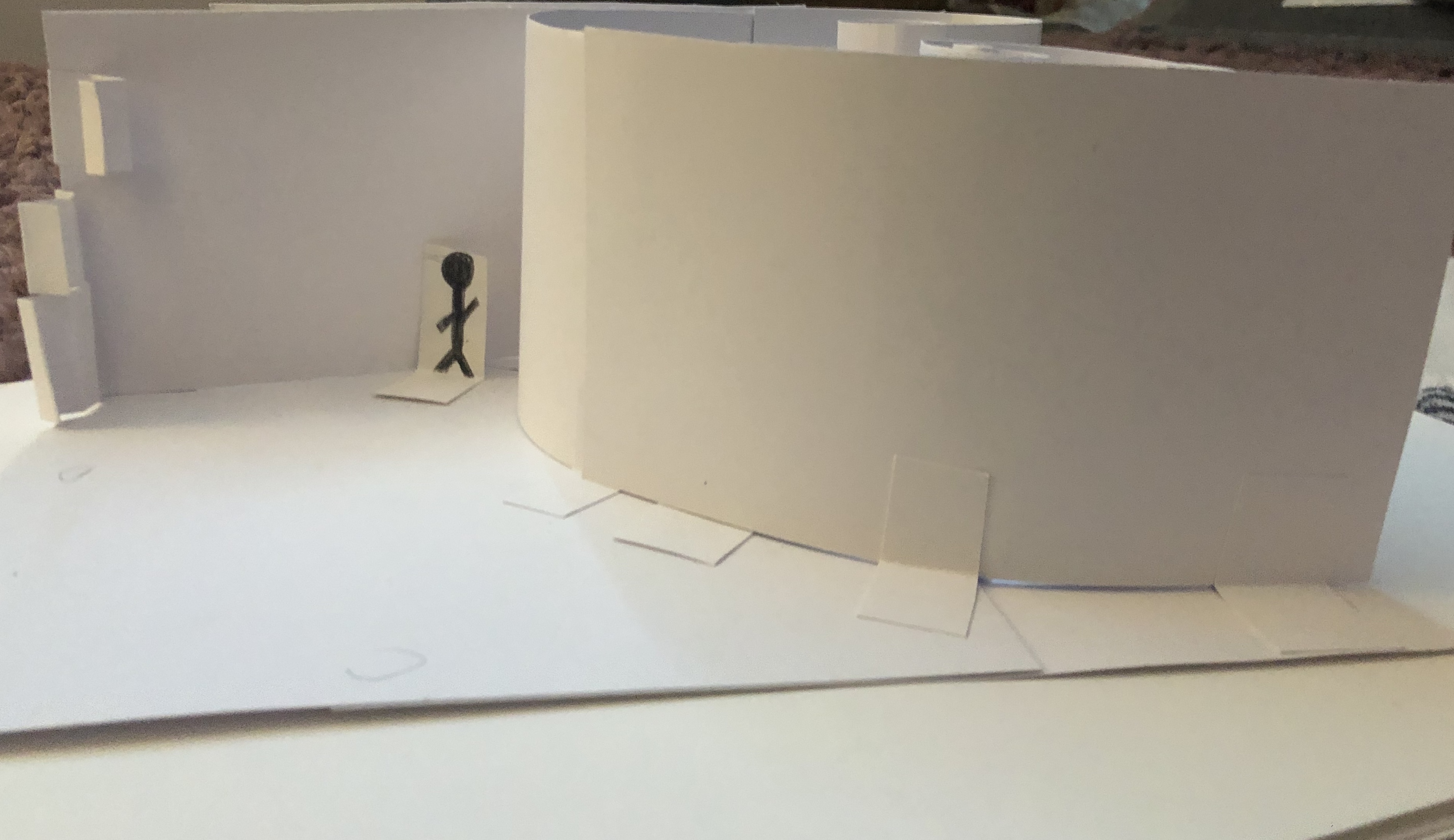
The materials/ finishes that the building is made up of, I have explored above and below. My aim in the aesthetic to the structure was minimal, taking inspiration from a classic contemporary art museum. With plain walls, contrasting with the masses of light coming through the glass window panels, to create depth against the bland walls. I have thought about the structure, lighting and different materials with sketching and rendering each aspect. Using drawing techniques such as two point perspective has helped get a more realistic view of the model in a building form as you get a sense of the size of walls, in comparison to a human.
I found drawing on my Laptop a lot easier compared to on paper. I liked using the different textures of pens and different medias in the programme I was using. I tried using both techniques of by hand on paper and electronically and I thought the laptop programme gave a more defined, and professional look. I found the perspective aspect of this task difficult to start with as I couldn’t get the hang of looking at the structure from an outside point of view however it helped using a model to show the comparison in size.
Method 1: Choose one of your drawings from either exercise 2.1 or 2.2. Lay either layout or tracing paper over your drawing and make a copy of it using a sharp pencil, by carefully and lightly tracing the outlines of the drawing. Do not include the guidelines. It is a good idea to do this on a hard surface so that you can use masking tape to hold both the original and the tracing paper in place. Position yourself so that you have the same view you had when you did the original drawing. This time, take notice of the materials that make up the space. Look closely at how light falls on the surfaces of those elements you have drawn in perspective. Where are the shadows and highlights, how do they fall, and how defined are they? Now, using any black or grey (and white if necessary – but not colour) medium of your choice, work into your drawing trying to capture a sense of the light, shade and atmosphere of the space. Consider how they might differ on certain materials, like fabric or metal.
Method 2: Just as you did in method 1, make a second copy of the selected original, by carefully tracing the outlines of the drawing using tracing paper that is held securely with masking tape. Position yourself so that you have the same view as when you did the original drawing. Look more closely at the materials, colours and textures of the surfaces of the floor, walls, ceiling and any objects or furniture etc. that you have included in your drawing. Using the colour medium of your choice, work into your line drawing trying to capture a sense of the materiality and textures of the space. This drawing will also capture light and shadow as the last drawing did.
I traced the outline I did for the two point perspective in the last exercise so can add some shading and colour. This helps add the finer detail in the space and add textures I have experimented with in previous tasks. I found this helpful to visualise the space better, and to get a better idea of the spacing of objects and furniture. If I was to do this task again, I would try different medias with this task, maybe charcoal or paint. This would help add different textures and colours to the drawings. I preferred the colour drawing, as it showcases the different aspects of the room.
Method:Use a layout or tracing paper, a pencil, a ruler if you wish (but preferably not) and an eraser. You could consider also using an ink pen to define your final drawing. Find an interior to draw in perspective. This could simply be the room you are already in! To create a one-point perspective drawing you need to find a view where you are facing a flat wall or surface straight on, rather than the corner of a room or space. First you draw your eye-level line. This is a horizontal line across the page at your own eye level. If you are sitting this will be lower on the page than if you are standing. Everything that is below your eye level will slope up towards this line and anything above your eye level will slope down to meet it.
Method: You can use same interior you used for exercise 3.1 or you can select another interior to draw, but this time you need to find a view where you are facing the corner of a room. Using the same materials in the previous exercise, just as you did before, start by drawing your eye-level line. Everything that is below your eye level will slope up towards this line and anything above your eye level will slope down to meet it. However, this time there will be two vanishing points. These should be located towards each side of the page but still on the eye level line.
One Point Perspective
This drawing is an example of a one point perspective drawing, which faces the main wall in the room, featuring a television, fireplace and windows. A perspective drawing helps envision how the room will look if you are looking at in person. It also helps with the sizing and accuracy of the different aspects of the room, such as the windows, doors and lighting.
Two Point Perspective
I found doing perspective drawing in two point, helpful to visualise the space in a more accurate way. The room I drew is a living room, with windowed doors leading to a patio outside. It also has a feature wall which is extended out from the wall including a television, an electric fire and a space for a sound bar. I fount perspective drawing helped me visualise the different pieces of furniture and how to draw them in three dimensional.
2.1 Method Using only a pencil and 10 pieces of paper, about A5 in size, draw a cube in perspective on each piece of paper. Do not use a ruler. Each cube should be roughly identical. When drawing the cubes, don’t worry if the lines are wobbly but you must ensure the lines meet/cross at each corner. Now using a pencil, take one of your cube drawings and set a timer for 20 seconds. Add texture to the cube to make the cube look like it is made from timber. Repeat this exercise 9 more times, each time using a different cube drawing and each time only using a pencil and only allowing yourself 20 seconds, to make the cube look like it is made from: • Glass • Sponge • Polished chrome (mirror) • Brick • Concrete • Leather • Wool fabric • Marble • Rusted metal
I found this task difficult as I like to add detail to the different sketches where as in this, I had to render the cubes in 20 seconds. Regardless of this, I still found it use full as It helped me think of the basic colours and detailing within the material.
2.2 Repeat exercise 2.1, but this time use any media you want and spend as much time as you want on each drawing. By the end of the exercise you should have another 10 cube drawings on separate sheets of paper, each rendered as one of the following materials: • Timber • Glass • Sponge • Polished chrome (mirror) • Brick • Jelly • Concrete • Leather • Wool fabric • Marble Try to capture the specific qualities of each material, including things such as light, shadow, tone, texture, reflections, colour etc. You can use a different medium for each material or mixed-media; whatever you think will best capture the qualities of that particular material Look back over all your drawings of cubes. Compare the drawings of each material from the 2 exercises. Which is most successful at representing the material? The quick drawing or longer drawing? Pencil or another medium? It might be different for different materials. What have you learned about the qualities and properties of the materials? Record your thoughts and reflections in your learning log.
Having longer to render the cubes was also difficult as I had to think about the finer detail. I found some materials easier than others, such as the sponge was slightly easier as there wasn’t much detail to add, however the wood and jelly for example were harder as they had a lot of detail and were harder to make look three dimensional.




 Georgia's Interior Blog