Reflection on Part 4

I have enjoyed Part 4 as I prefer drawing, and experimenting with different medias compared to researching and typing. I loved creating the collages and trying to showcase different medias whilst including skill of drawing. If I were to do the collages and drawings again, I would maybe try and be a bit more experiential with colours and ways of displaying the drawings.

Moving onto the next part of rendering the cubes. I found this task difficult even though I have had to complete a similar task within my product design A Level class. The 20- second task was hard and I like to include a lot of detail, but with the time scale this wasn’t possible. In the next part I had longer to complete the renders in the cube, which was more suited to me personally. I enjoyed trying to explore the different materials and helped me widen my knowledge on how to draw them.

The Perspective drawing part of this project has really helped me develop my drawing skills further. If i were to this task again however I would have tried to draw larger pieces of furniture as it would have been good to get practise in for harder to draw pieces. I would have liked to draw a more unusual room with different shapes, however this would have been difficult and may have not looked as effective. The room I did pick included interesting materials such as laminate wood floor and a fluffy rug, which helped with me practising my renders.

Assignment Four: Visualisation

Brief: Combine all the skills, techniques, process and knowledge you have developed in this part to create an interior visual of your model from Part 1 – Analysis: Atmosphere & Experience.
TIP: Before you start to draw your visual, you may wish to make some changes to your model from Part One based on the feedback you received at that stage. Alternatively, you could choose one of your sketch-models to draw from if you think that they would provide a more interesting visual.

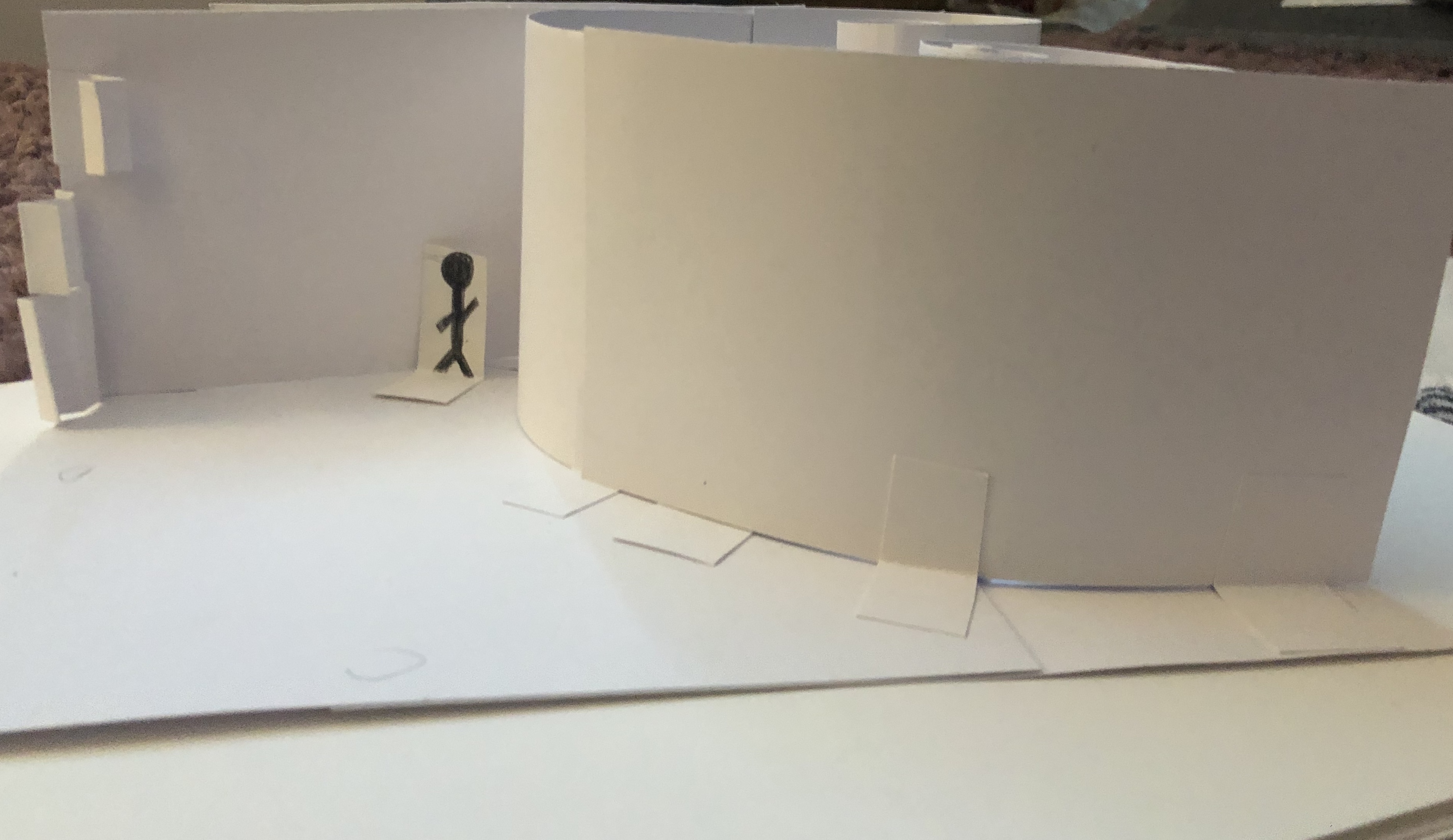
The materials/ finishes that the building is made up of, I have explored above and below. My aim in the aesthetic to the structure was minimal, taking inspiration from a classic contemporary art museum. With plain walls, contrasting with the masses of light coming through the glass window panels, to create depth against the bland walls. I have thought about the structure, lighting and different materials with sketching and rendering each aspect. Using drawing techniques such as two point perspective has helped get a more realistic view of the model in a building form as you get a sense of the size of walls, in comparison to a human.

I found drawing on my Laptop a lot easier compared to on paper. I liked using the different textures of pens and different medias in the programme I was using. I tried using both techniques of by hand on paper and electronically and I thought the laptop programme gave a more defined, and professional look. I found the perspective aspect of this task difficult to start with as I couldn’t get the hang of looking at the structure from an outside point of view however it helped using a model to show the comparison in size.

Exercise 3.3: Perspective with Tone & Colour

Method 1: Choose one of your drawings from either exercise 2.1 or 2.2.
Lay either layout or tracing paper over your drawing and make a copy of it using a sharp pencil, by carefully and lightly tracing the outlines of the drawing. Do not include the guidelines. It is a good idea to do this on a hard surface so that you can use masking tape to hold both the original and the tracing paper in place.
Position yourself so that you have the same view you had when you did the original drawing.
This time, take notice of the materials that make up the space. Look closely at how light falls on the surfaces of those elements you have drawn in perspective. Where are the shadows and highlights, how do they fall, and how defined are they?
Now, using any black or grey (and white if necessary – but not colour) medium of your choice, work into your drawing trying to capture a sense of the light, shade and atmosphere of the space. Consider how they might differ on certain materials, like fabric or metal.

Method 2: Just as you did in method 1, make a second copy of the selected original, by carefully tracing the outlines of the drawing using tracing paper that is held securely with masking tape.
Position yourself so that you have the same view as when you did the original drawing.
Look more closely at the materials, colours and textures of the surfaces of the floor, walls, ceiling and any objects or furniture etc. that you have included in your drawing.
Using the colour medium of your choice, work into your line drawing trying to capture a sense of the materiality and textures of the space. This drawing will also capture light and shadow as the last drawing did.

I traced the outline I did for the two point perspective in the last exercise so can add some shading and colour. This helps add the finer detail in the space and add textures I have experimented with in previous tasks. I found this helpful to visualise the space better, and to get a better idea of the spacing of objects and furniture. If I was to do this task again, I would try different medias with this task, maybe charcoal or paint. This would help add different textures and colours to the drawings. I preferred the colour drawing, as it showcases the different aspects of the room.

Exercise 3.1&2: One &Two-Point Perspective

Method:Use a layout or tracing paper, a pencil, a ruler if you wish (but preferably not) and an eraser. You could consider also using an ink pen to define your final drawing.
Find an interior to draw in perspective. This could simply be the room you are already in!
To create a one-point perspective drawing you need to find a view where you are facing a flat wall or surface straight on, rather than the corner of a room or space.
First you draw your eye-level line. This is a horizontal line across the page at your own eye level. If you are sitting this will be lower on the page than if you are standing. Everything that is below your eye level will slope up towards this line and anything above your eye level will slope down to meet it.

Method: You can use same interior you used for exercise 3.1 or you can select another interior to draw, but this time you need to find a view where you are facing the corner of a room.
Using the same materials in the previous exercise, just as you did before, start by drawing your eye-level line.
Everything that is below your eye level will slope up towards this line and anything above your eye level will slope down to meet it.
However, this time there will be two vanishing points. These should be located towards each side of the page but still on the eye level line.

One Point Perspective

This drawing is an example of a one point perspective drawing, which faces the main wall in the room, featuring a television, fireplace and windows. A perspective drawing helps envision how the room will look if you are looking at in person. It also helps with the sizing and accuracy of the different aspects of the room, such as the windows, doors and lighting.

Two Point Perspective

I found doing perspective drawing in two point, helpful to visualise the space in a more accurate way. The room I drew is a living room, with windowed doors leading to a patio outside. It also has a feature wall which is extended out from the wall including a television, an electric fire and a space for a sound bar. I fount perspective drawing helped me visualise the different pieces of furniture and how to draw them in three dimensional.

Exercise 2.1: 10 Cubes: 20-second Pencil Renders + Exercise 2.2: 10 Cubes: Mixed Media Renders

2.1 Method Using only a pencil and 10 pieces of paper, about A5 in size, draw a cube in perspective on each piece of paper. Do not use a ruler. Each cube should be roughly identical.
When drawing the cubes, don’t worry if the lines are wobbly but you must ensure the lines meet/cross at each corner. Now using a pencil, take one of your cube drawings and set a timer for 20 seconds.
Add texture to the cube to make the cube look like it is made from timber.
Repeat this exercise 9 more times, each time using a different cube drawing and each time only using a pencil and only allowing yourself 20 seconds, to make the cube look like it is made from:
• Glass
• Sponge
• Polished chrome (mirror)
• Brick
• Concrete
• Leather
• Wool fabric
• Marble
• Rusted metal

I found this task difficult as I like to add detail to the different sketches where as in this, I had to render the cubes in 20 seconds. Regardless of this, I still found it use full as It helped me think of the basic colours and detailing within the material.

2.2 Repeat exercise 2.1, but this time use any media you want and spend as much time as you want on each drawing. By the end of the exercise you should have another 10 cube drawings on separate sheets of paper, each rendered as one of the following materials:
• Timber
• Glass
• Sponge
• Polished chrome (mirror)
• Brick
• Jelly
• Concrete
• Leather
• Wool fabric
• Marble
Try to capture the specific qualities of each material, including things such as light, shadow, tone, texture, reflections, colour etc. You can use a different medium for each material or mixed-media; whatever you think will best capture the qualities of that particular material
Look back over all your drawings of cubes. Compare the drawings of each material from the 2 exercises. Which is most successful at representing the material? The quick drawing or longer drawing? Pencil or another medium? It might be different for different materials. What have you learned about the qualities and properties of the materials?
Record your thoughts and reflections in your learning log.

Having longer to render the cubes was also difficult as I had to think about the finer detail. I found some materials easier than others, such as the sponge was slightly easier as there wasn’t much detail to add, however the wood and jelly for example were harder as they had a lot of detail and were harder to make look three dimensional.

Examples of Interior Designers Capturing movement in their work.

The first space I have found is by the Interior Design firm Gensler with there silver certified New York office. As shown in the image below, you can see the way they have used an unusual lighting design to show the flow of the office with its idiosyncratic aesthetic. Also with the slanted windows maybe represents a shelter like feel as it hangs over the edge of the building like an airport hanger.

https://www.interiordesign.net/articles/14968-interior-designers-champion-the-wellness-movement/

The next designer is Jessica Helgerson who showcases her modern style whist still including classic colours and designs. The movement is showcased with the different furniture pieces around the designs. For example in the image below there is a circular theme to the pieces included which creates movement as you go around the sofa/ table to access it. Industrial ceiling gives a sense of a more open space,rather than a boxed in restaurant with a lower ceiling.

https://www.interiordesign.net/articles/14968-interior-designers-champion-the-wellness-movement/

Robins Architecture work also shows a sense of movement within their designs, for example in the image below, it shows the flow of the room with the shutters in the centre of the room, as it is in the direction that the user would move around the room. The lighting in the image below also creates a warmer feel towards the bed area, which invites you in, whilst a harsh table lamp in a spot light shape creates a still movement.

http://robbins-architecture.com/projects

The designer Miles Rudd uses many horizontal lines within the movement of this design. The wooden beam in the centre of the ceiling makes he room look larger and taller the White also has the same effect. The white units and doors are as if it has a blank canvas with space to add quirky little hints of colour and different aspects.

https://freshome.com/harmony-and-unity

1.3 Digital Collage

Aim; You saw in the last exercise how the art of collage can be used to help generate images or visuals. This technique can be also be achieved digitally using Adobe Photoshop or similar software. Using a combination of different styles and mediums both digital and analogue can create impact and intrigue in visuals. This exercise will introduce you to the basics of creating digital collages by encouraging you to experiment with software to recreate one of your drawings from the previous exercises.

For these digital edits I have used the Photoshop programme. Using stock images from the internet (linked below), my own sketches and patterns, I have edited them together to create different collages. I have tried to focus on changing texture and colours for unique finishes, I have done this by using the magic wand tool to remove white backgrounds, posterized layers and a layer mask to remove aspects I didn’t want included. I changed colours by using the selective colour adjustment and colour balance. Messing around with the adjustment layers makes layers either stand out of blend into the background.

References; Foil https://www.google.com/search?q=foil+jpg&source=lnms&tbm=isch&sa=X&ved=0ahUKEwjBgN7k2PTlAhWObsAKHXKvCkAQ_AUIEigB&biw=1368&bih=802&dpr=2#imgrc=i9dx33_SlVQRjM: RedBull https://www.google.com/search?q=foil+jpg&source=lnms&tbm=isch&sa=X&ved=0ahUKEwjBgN7k2PTlAhWObsAKHXKvCkAQ_AUIEigB&biw=1368&bih=802&dpr=2#imgrc=i9dx33_SlVQRjM: Felt; https://www.google.com/search?q=pink+felt&source=lnms&tbm=isch&sa=X&ved=2ahUKEwjdnuSS9vvlAhVko3EKHYydBCYQ_AUoAnoECAwQBA&biw=1368&bih=802#imgrc=h3W7phTtWgBzPM: Marmite https://www.google.com/search?q=marmite+texture&source=lnms&tbm=isch&sa=X&ved=2ahUKEwjE0f6p-_vlAhVMTxUIHS4WBUcQ_AUoAXoECA8QAw&biw=1368&bih=802#imgrc=eyEr719WHGkS8M:

Part 4 1.2 Experimenting With Media

Aim: This exercise, which is split into 3 methods, is about practising drawing and visualisation skills and building your own visual identity through the play and experimentation of different mediums. By practicing drawing with different materials, processes and techniques, you will start to develop your own personal drawing style and learn how to manipulate different mediums to achieve particular effects, lines, marks and textures.

I have experimented with many different medias for this task. I tried biro, charcoal, pastel pencil and pastel crayons which all gave a different end result. I then made a collage using my sketches, scrap bits of paper and different materials to create the tasks brief.

Using different textures such as foil and different papers creates a different finish for the collages. I also used paints, wax crayon and pencils to add different colours too.

Mixed Media

Part 4 1:1 Drawing Objects.

Aim: The aim of this exercise is to introduce you the practice of observing and drawing objects in “still life” using different styles and drawing techniques. You will begin to notice and record the interaction between the objects using a representation of light, shade, texture and line.

The drawings I have created are based around every day house hold objects. Attempting different ways of drawing an object over and over helps you see it in a different way and notice details you didn’t at a first glance. I have labelled each drawing with each task that was set in this section.

Reflection on my Tutors Feedback

I am overall very happy with how pat three went and my Tutors feedback. The first part of what my tutor touched on was my research, for example how to execute my drawing accurately. A suggestion was gridded paper to help keep my lines straight and accurate. In my future technical drawings I will use this technique to improve the quality of my drawings. If I were to do my drawings again I would of done some research on existing sketches and how to make them as accurate as possible.

The next section was about my Communication & Presentation of my work. A point my tutor pointed out was to take pictures from different angles of the object I am drawing to keep the drawing in one dimension, as I touched on the fact that I was struggling with staying in 2D. The pictures will help me stay focused on one view of the object without it looking 3D. Also using stencils will help improve the quality of my work. For example using text Stencils like shown below, to keep my extra details neat. Also using a flexible ruler will help with measuring awkward angles and aspects of a shape such as a lantern.

Critical Reflection was the next point of feedback I got from my tutor, which mentioned researching practitioners who are of interest to me. This is to reflect and develop my work and develop it further is better detail. Michelle Ogundehin is a design practitioner who is widely famous for her work within design but also know for her TV presenting as she recently featured as a judge on the BBC series ‘Interior Design Masters.’ This show showcased around 12 different designers capability of designing around a given brief. Ogundehin showed her Interior design knowledge on the programme by giving critical feedback to the contestants to help them hit the brief in a better way.

https://www.sohohome.com/stories/house-to-home-michelle-ogundehin

The above images showcases examples of her work. Her style involves a range of pastel colour with hints of brighter contrasts. She includes classic furniture pieces mixed with modern ornaments to create an up-to date aesthetic. I like the way she involves unique and ‘wacky’ objects within her styling to make her work stand out amongst the bland crowd. I think her work is inspiring and i would like to take aspects of her work and translate it into mine.

A tip from my tutor was to read through a book called ‘Interior Design Visual Presentation : A Guide to Graphics, Models and Presentation Methods’ by Maureen Mitton. Chapter four is all about drawing and sketching Interior environments, which includes drawing in perspective which will help me in future sketches and presenting my work in a more professional way. As I was producing my sketches I didn’t have the best idea of what I was doing as I have had very minimal experience with drawing plan’s of buildings and furniture. This book will help me with how to draw certain things, and how to render them if needed. The book gives you step by step instructions on how to do each type of sketch whilst explaining the reason why they need to be conducted in that way. It also show how to draw them to scale, or to show the scale by drawing a human shape to show how big they would be in comparison to the room. Drawing with grids is also a helpful tip to get the perspective angles correct as I have struggled with that in the past.